Types of Data Visualization
Data visualization is the graphical representation of large data sets. In today's data-driven environment, visualization has become vital to data analysis. Businesses can use various effective data visualization techniques to get insights and make data-based decisions.
Data visualization tools offer an easy-to-use means of seeing and comprehending trends, outliers, and patterns in data through visual elements such as charts, graphs, and maps. It also allows staff members or company owners to communicate data to non-technical audiences.
To analyze vast volumes of data and make data-driven decisions, data visualization tools and technologies are crucial in the Big Data environment.
What is Data Visualization?
Data visualization is the practice of representing information and data through visual elements like graphs, charts, or maps. Its main objective is to highlight insights that might be overlooked in a simple list of values and numbers, making it easier and quicker for people to comprehend complex data.
How Data Visualization Fuels Strategic Decisions
More than just creating fancy pie charts and graphs, data visualization is pivotal in strategic decision-making because it distills complex information and makes it easily understandable and actionable. With the sheer volume of data available today, it can be overwhelming to make sense of it all.
However, data visualization simplifies this process by presenting data in a visual format that lets us quickly grasp patterns, trends, and insights. It enables decision-makers to spot opportunities, identify problem areas, and make informed choices based on real-time data. In a world where data is king, data visualization is the secret weapon that helps organizations unlock the power of their data and stay ahead of the competition.
Visualizations are a common language that transcends technical jargon and allows everyone to participate in strategic discussions. It facilitates collaboration, encourages data-driven conversations, and enables organizations to align their goals and make more informed decisions.

Essential Data Visualization Types
Let’s cover the most common types of data visualization used to help with data analysis. Some of them are more common visualization methods, such as bar charts or line graphs, which cover primarily numeric data, and others are more specific and deal with more complex data, like heat maps and dashboards.
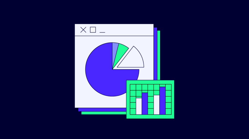
Charts and Graphs: The Basics of Data Representation
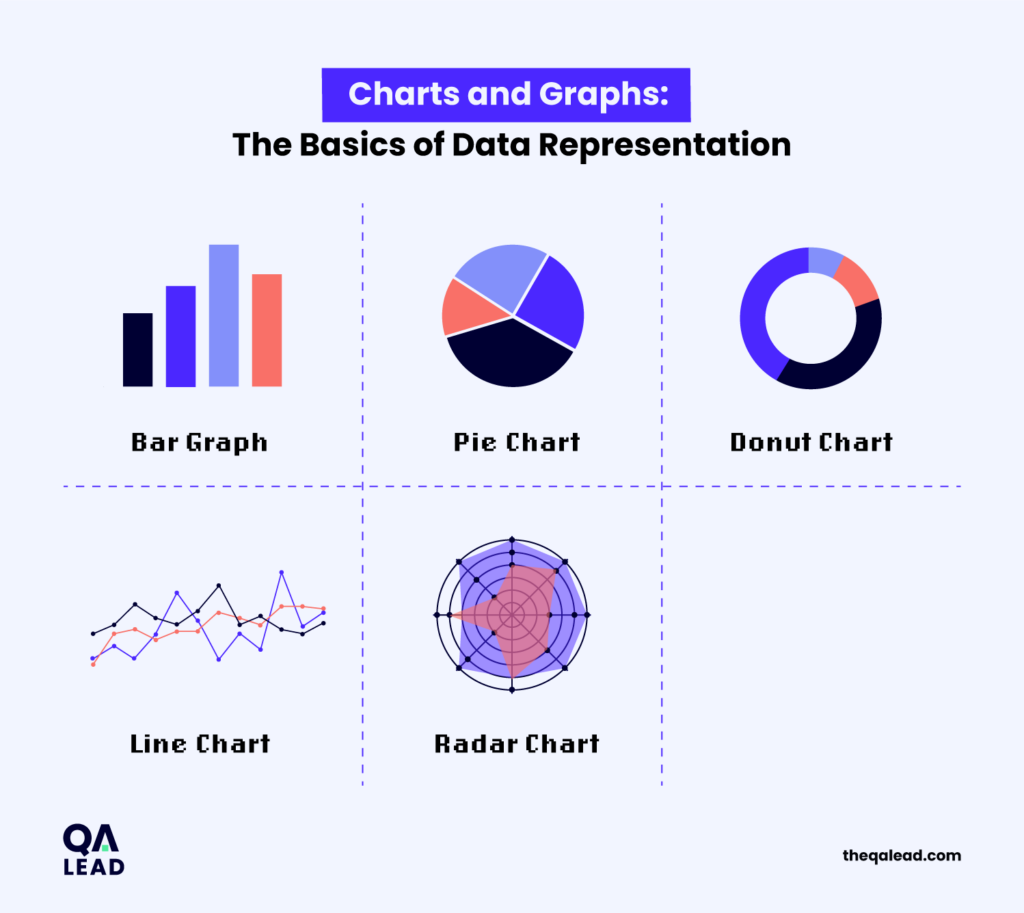
The most basic types of data representation are charts and graphs. These are better fitted for visualizing numeric data.
- Bar graph: A bar chart is a visual representation of data that uses rectangular bars of varying lengths to compare different categories or values.
- Pie chart: Pie charts utilize a circle divided into sectors to display the proportion of each category or value relative to the total. Different colors are often used to differentiate between the sectors and make it easier to read and understand.
- Donut chart: A donut chart looks like a pie chart with a hole in the center. It shows the percentages of each category or value relative to the total and can be more space-efficient than a regular pie chart.
- Line chart: Also known as a line plot or a line graph, it is a type of chart that uses straight lines to connect data points, illustrating the relationship between different variables or data points over time. Line graphs are commonly used in various fields, including finance, engineering, and science, to display trends, patterns, and changes in data over time.
- Radar chart: Sometimes referred to as a spider chart or a star chart, a radar chart is a graphical tool used to display multivariate data in a two-dimensional form. It comprises multiple axes that radiate from a central point, with each axis representing a different variable or dimension. The values for each variable are plotted on the respective axis and connected by a line or shape, creating a radial, spiderweb-like pattern. Radar charts are commonly used to compare and visualize the performance or characteristics of multiple entities or categories across various factors. They are especially useful when comparing multiple variables on a single chart and allowing for easy identification of strengths, weaknesses, and patterns across the data.
Interactive Dashboards: Real-time Data at Your Fingertips

More complex ways of visualizing data are interactive dashboards. Interactive dashboards are digital tools that allow users to explore and analyze data in a visually dynamic and customizable way. Users can interact with the data in real-time, manipulating it and drilling down into specific details for better insights.
- Area chart: Area charts are similar to line graphs but with the area between the line and the axis shaded or filled, which provides a visual representation of the magnitude or proportion of the data. Area charts are commonly used to show trends, comparisons, and patterns in data over time or across variables.
- Gantt chart: The chart consists of horizontal bars representing individual tasks or activities arranged along the vertical axis corresponding to the project tasks. The length of each bar represents the duration of the task, and the position of the bars shows their start and end dates. Dependencies between tasks are displayed through connecting lines. Gantt charts are used in various industries to monitor project progress, plan resources, and track project timelines. They help project managers and team members understand task dependencies, identify critical paths, allocate resources efficiently, and easily visualize project milestones.
- Venn diagram: A Venn diagram is a visual representation that uses overlapping circles to show the relationship between different sets or groups of items. Each circle in the diagram represents a set, and the overlapping area between the circles represents the intersection of those sets. Venn diagrams are commonly used to illustrate similarities, differences, and overlaps between different categories or concepts, helping to visualize and understand the relationships and connections between them. They are widely used in various fields, including mathematics, logic, statistics, and data analysis, to analyze and organize information clearly and concisely.
- Flowchart: A flowchart is a visual representation of a process or workflow, using various shapes and arrows to depict the sequence of steps, decisions, and actions involved. It enables the visualization of the flow of information or activities within a system or a process from start to finish. Each shape in the flowchart represents a specific action or task, and arrows indicate the directional flow between them. Flowcharts are widely used in different fields, such as software development, project management, and process analysis to design, communicate, and analyze complex processes, identify bottlenecks, and improve efficiency.
- Infographic: Infographics combine text, images, and graphics intending to present information in a way that is easy to understand and visually appealing. They are usually used to simplify complex concepts, present statistics or data trends, tell a story, compare different variables, or highlight key messages. Infographics are popular for their ability to capture attention, present information in a digestible format, and improve understanding by using visual elements to highlight the message being communicated.
- Heatmap: A heatmap is a visual representation of data using color-coded cells within a matrix or table. Heatmaps are often used to show the distribution and density of values within the dataset. Each cell in the heatmap contains a color that corresponds to a specific value, with darker colors indicating higher values and lighter colors indicating lower values. Heatmaps are commonly used in data analysis, statistical visualization, and machine learning to identify patterns, outliers, trends, and correlations within large datasets. They allow data analysts and researchers to intuitively recognize clusters, clusters of data points, or hotspots within the data without the need for complex calculations or statistical analyses, making it one of the most popular tools for data visualization and analysis.
- Histogram: A histogram is a visual representation of numerical data distribution. It consists of rectangles, or bars, where the width of each bar represents a particular interval or range of values, and the height represents the frequency or count of data points falling within that interval. Histograms are used to evoke the shape, central tendency, and spread of a dataset. They provide insights into data distribution, such as whether it is symmetric, skewed, or exhibits potential outliers.
4 Pillars of Data Visualization
Noah Iliinsky, one of the most critical figures in creating diagrams and different types of data visualization, has developed the main pillars of information visualization.
A more systematic, process-oriented approach to visualization can be taken by adhering to Iliinsky's pillars, which can make it much simpler to create reports that genuinely inspire your audience to act or start perceiving the information differently.
- Purpose: Before you decide on the best data pieces to bolster your argument, you must first understand what you're trying to say. Rearranging the data points in your reports to better reflect the overarching objectives of your team can be helpful. You should choose data points that show the frequency and root cause of incidents if one of your team's objectives is to reduce the number of occurrences.
- Content: It gets simpler to choose the facts or content that will best serve your purpose after you have a clear idea of what you want to convey. Only include content that reinforces the point you're making; leave out everything else. The likelihood that your message will be understood decreases with the amount of information your audience must process to understand it.
- Structure: It is easier to conceptualize the structure of the data once you can clearly state your purpose and are aware of the material that backs up that articulation. Structure, in Iliinsky's opinion, is your visualization's physical arrangement. An entity-relationship diagram, line graph, scatterplot, or map can all be components of the structure.
- Formatting: It is easier to conceptualize the structure of the data once you can clearly state your purpose and are aware of the material that backs up that articulation. Structure, in Iliinsky's opinion, is your visualization's physical arrangement. A tree diagram, line graph, scatterplot, or map can all be components of the structure.
Tools and Technologies for Effective Visualization
A data visualization tool is a software program used for data visualization. Each tool has different features, but in essence, they all let you input a dataset and make graphic changes to it. The majority, though not all, include pre-made templates for making basic visuals.
- Tableau: Tableau is a widely used data visualization tool due to its ease of use and robust features. It can create a wide range of maps and charts by connecting it to multiple data sources. Tableau is owned by Salesforce and is used by numerous individuals as well as large corporations. Tableau comes in multiple versions, including web, server, and desktop versions, in addition to some CRM software. With its ability to integrate with sophisticated databases such as Teradata, SAP, My SQL, Amazon AWS, and Hadoop, Tableau effectively generates visualizations and graphics from vast and dynamic datasets in Big Data, AI, and machine learning applications.
- Google Charts: Renowned for its ability to create graphical and pictorial data visualizations, Google Charts, one of the leading players in the data visualization market, is coded with SVG and HTML5. Zoom functionality is available in Google Charts, and users can take advantage of unparalleled cross-platform compatibility with iOS, Android, and even older Internet Explorer versions.
- Power BI: Microsoft's user-friendly data visualization tool, Power BI, can be deployed on cloud infrastructure or installed on-premises. One of the most comprehensive tools for data visualization is Power BI, which works with a wide range of backend databases, including Excel, Teradata, Salesforce, PostgreSQL, Oracle, Github, Adobe Analytics, Azure, and SQL Server. The enterprise-level tool offers real-time insights for quick decision-making along with beautiful visualizations.
- Grafana: Grafana open-source is a free analytics and visualization tool. You can query, view, monitor, and review metrics, logs, and traces. It has tools for creating illuminating graphs and visualizations from time-series database (TSDB) data. A Graohana cloud component is also included. It is a fully controlled, fast, and highly available OpenSaaS logging and metrics platform. Grafana Enterprise is the commercial version of Grafana, with extra features not found in the open-source version. It includes enterprise data sources, advanced authentication options, broader permission restrictions, round-the-clock support, and core team training.
- plotly: Another open-source tool, plotly integrates fully with analytics-focused programming languages such as Matlab, Python, and R, allowing for complex visualizations. Plotly, mainly used for collaborative work, disseminating, editing, creating, and sharing interactive, visual data, supports both on-premise and cloud deployment.
- RAWGraphs: Also known as RAW, it operates on delimited data files, such as CSV or TSV files. It acts as a bridge between spreadsheets and data visualization. Despite being a web-based application, RawGraphs offers strong data security and a variety of conventional and non-conventional layouts.
Aligning Data Visualization With Business Goals
Strategic Planning with Visual Data Insights
Strategic planning analyzes an organization's current situation, sets goals and objectives, and outlines a path to achieve those goals. One of the most powerful tools to help with strategic planning is visual data insights. These insights can help identify patterns and trends that can inform strategic decision-making.
Visual data insights can help identify key performance indicators (KPIs) for an organization and track progress toward achieving those KPIs. For example, a retail company can use visual data insights to track sales data, inventory levels, and customer satisfaction metrics. By monitoring these KPIs over time, they can identify areas of opportunity and make changes to improve performance.
In addition to tracking KPIs, visual data insights can also help identify new opportunities for growth and innovation.
By analyzing industry trends and market data, organizations can identify emerging markets, consumer preferences, and potential partnership opportunities. With this information, organizations can strategically expand their offers and reach new audiences.
Communicating Complex Data to Stakeholders
Another benefit of using visual data insights in strategic planning is that they can communicate complex ideas and data to stakeholders. By presenting data in a visual and easily digestible format, stakeholders can quickly understand the key insights and the impact they may have on the organization.
Another effective way to communicate complex data is through storytelling. By presenting data within a narrative structure, stakeholders can better understand the context and relevance of the information. This can involve creating a compelling narrative with a clear beginning, middle, and end, using data to support each part of the story. By framing the data like this, stakeholders can better connect with the information and its implications.
It is also essential to provide clear and concise explanations of what the data means and the potential impact on the organization. Avoid using technical jargon or complex terminology that may confuse stakeholders. Instead, focus on providing practical insights and actionable recommendations that stakeholders can easily comprehend and act upon.
Data Visualization Contributes to Success
Data visualization is a useful tool for businesses to analyze and interpret complex data sets, and there are many types of visualizations to choose from depending on the insights needed. Each type has strengths and weaknesses, and finding the right visualization type to represent the data is important for effective communication. A heatmap may be suitable for identifying patterns in data sets, while a bar chart may be ideal for comparing data across categories.
Many tools are available to help businesses create visualizations, from free and easy-to-use online platforms to more robust and customizable software. While there are initial investments in data gathering and analysis, effective visualization enables businesses to identify opportunities and make more informed decisions that increase efficiency, generate revenue, and reduce costs. As businesses encounter increasingly complex challenges and the pace of technological change accelerates, data will continue to play an increasingly critical role, and data visualization will continue to be an excellent tool for success.
If you found this article helpful, please subscribe to our newsletter for more quality assurance best practices and insights.