Usability And UX Reviews As Part Of QA

If you think good design is expensive, you should look at the cost of bad design.
Dr. Ralf Speth, CEO, Jaguar Land Rover
In the last decade, user experience has become the real differentiator between good applications and great ones.
The tech side of building software is somewhat of a solved problem. The real possibilities for outsized success with software products lie in UX. The next killer app will have an instantly usable interface. This has led to a research-based UX-focused approach towards product development.
The results of this focus speak for themselves.
For instance, every dollar invested in UX generates $100 in return, according to a Forrester Research Report. Additionally, over a 10 year period, a study shows that the financial performance of design-driven companies outshines that of the S&P by 219%.
There is also the legendary tale of how simply changing the text on one button added $300 million in sales to an e-commerce company in one year!
However, in spite of all this hype and hoopla, for every application with a great user experience, there are several lacking or severely lacking in that department. The terrible ones are easy to spot, they make you want to punch a hole in your laptop screen or fling your mobile device through a window. Darwin takes care of those applications.
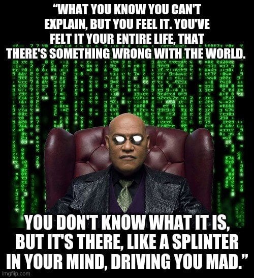
The real challenge is apps with OKish UX. Those are the kind that are the proverbial “splinter in your mind” experiences that you cannot for the life of you figure out why you don’t like!
I can hear you say, “We know all this; I’m reading The QA Lead for crying out loud, so what does this have to do with me?” I’m coming to that.
The Importance Of UX
During my early days managing engineering teams, we were working on a large software solution project for one of our customers. This was part of a larger digital transformation strategy that was being implemented for that customer. It was a typical engineering team consisting primarily of software developers and QA engineers using Scrum with 2-week sprints.
There was a small UX team but, for the most part, it was shared between projects. Typically, the UX folks joined team stand-ups during the early parts of the project but, once the customer approved the visual design, they would hand over all the templates for the visual design as well as the flows and then go off to work on other projects.
During the first sprint demo, the customer seemed primarily concerned with the fact that the visual design and the user interface did not exactly match the design templates. There was also a gap between the functionality that was proposed and what was actually implemented.
Mind you, the gap was not large but, no matter how much we attempted to reassure our customer that the UX aspect was going to be cleaned up during one of the latter sprints, his body language showed that he was not pleased about it.
Thankfully, the QA lead on our team piped up, said that this was an anomaly and that it would not happen again. And then she did something amazing. Let me outline it here:
- She took it upon herself to brush up on her UX knowledge by doing some intensive reading.
- Then she herself did a basic UX heuristic review for the functionality that was delivered, spoke to the UX folks, and got their help where needed.
- She created new tasks in JIRA to fix the delta between what was promised and what was delivered—from a UX perspective.
- She set up a call with our UX Chief and got his approval to ensure that a new process was instituted where the visual aspects of the application were fixed during each sprint and not just at the end.
- Finally, she also got our QA folks to understand UX basics so that they could spot glaring issues and help the team to tackle them early on.
The icing on the cake? During the next sprint demo, the product owner/customer was all smiles and after a few months, our QA lead was promoted to QA Manager! 😉
Romantic Versus Classical Perspectives Of Reality
This entire episode got me thinking about the huge gap between the way we in engineering view an application and how customers and users view it. Robert Pirsig in his seminal book Zen and the Art of Motorcycle Maintenance talks about two perspectives of reality: classical and romantic.
According to Pirsig, those whose dominant perspective is romantic view things and judge them based on how they appear. They are primarily interested in how things are and do not care about how they work—the underlying order. This is the artistic half of the art/science divide.
On the other hand, we engineers & scientists subscribe to the classical view where beauty is in the mechanisms that underlie outer form. Engineers can see beauty in python code, or under the hood of a car, which looks ugly to those from the romantic side.


Like everything else, this is obviously not a binary classification but a continuum with most of us dominantly preferring one perspective.
There are some interesting implications of this way of classifying the world:
1. Most people’s dominant perspective by default is either classical or romantic, not both.
2. Folks - think customers, internal or external - with the romantic perspective vastly outnumber those with the classical perspective. If you ever had to play the role of tech support for family and friends, you know what I’m talking about!
3. Very few can switch modes and even for those, it is an activity that involves effort.
4. Reality = classical + romantic. They are not mutually exclusive. Both are essential aspects of the totality. Beauty is functional. Function can be beautiful.
Take flowers, for instance. They have such gorgeous patterns that seem to have no function. Yet the beauty we see in flowers has an underlying structure rooted in math: the Fibonacci sequence governs the structure and patterns that we see in flowers. Structure and ethereal beauty go hand in hand in nature.
And it's not just about beauty. The arrangement of seeds in a sunflower follows the Fibonacci sequence and the Golden Ratio in order to fit the maximum possible number of seeds in the flower. The same principles apply to engineering and user experience.

This, finally, brings us to the crux of this article: quality engineering folks are ideally positioned to take advantage of both these apparently competing perspectives.

The Role Of Software QA In UX / Usability
As a testing professional, you have had a lot more experience with interfaces than the average developer or user.
You’ve rigorously and repeatedly (ad nauseum!) tested so many applications that you may have reached the level of higher-order aka 4D thinking as far as UX is concerned, like the proverbial chess grandmaster who thinks in positions as opposed to yours truly who struggles to figure out which piece to move next! ;-)
Which is why, despite the massive move towards automation—a great move, without a doubt—there is something to be said for some manual testing. After all, if humans are going to use an application, it makes sense to get a human perspective out of testing.
How To Perform A UX / Usability Review As A Test Engineer
If quality assurance needs to take UX into account, it needs to begin right alongside the design stage i.e. at the beginning of the life cycle. Here are the steps you can follow to include the UX review in your testing and be a QA polymath!
Usability Heuristics For User Interface Design
Acquaint yourself with the 10 general principles for interaction design by Jakob Nielsen. This set of guidelines is a reliable reference point for any usability review. Factor these principles into your discussions with the UX team as well as your test plan. You could also check out any number of basic courses on usability and UX design.
Learn The Principles Of Accessibility
You may have done accessibility testing as part of your test plan in the past, but understanding the principles behind accessibility—perceivable, operable, understandable, robust—will arm you with the ability to see what others might miss.
The UX Team Is Your New Hangout
Don’t be a stranger: get to know the UX team on the project. Collaborate with them. Share your test plan with them and get feedback on what you can include from a UX point of view.
The benefits of this interaction are two-way as your test plan will give the design team insight into the feasibility of design features that they wish to propose. As a QA lead, your interaction with the UX team needs to be just as close as that with the developers.
Include Analytics In Your Test Plan
The user analytics on the product you are testing is a gold mine of information for testers. Analytics can help you identify risk areas and user behavior. These, in turn, can help you to identify and prioritize fixes as early as possible in the product life cycle.
Shift Left ‘till You Can’t Shift No More
The product you are testing is like a baby. You need to make sure it is getting the help it needs right from the conception of the product. Go all the way to the beginning.
Before Development
Test at the design stage as soon as a prototype is ready. Use your experience with applications and your knowledge of the usability principles and accessibility guidelines to check if any changes need to be made BEFORE the product moves to the development stage.
If QA is not yet part of the design phase, make it happen, if possible.
Targeted Manual Testing
Go through the entire experience of using the product from start to finish as a part of manual testing. Focus on asking the right questions, thinking like a user as well as a QA Engineer.
Start by stepping back and looking at the product from a broader perspective. Do you enjoy the experience?
Then take a closer look. Is it easy to use? Are the flows obvious and intuitive? Are they tedious and slow? Are there any overlaps or duplication of actions that may prove annoying to the user? Is the design usable at different screen sizes?
Finally
The future of work belongs to those with multiple sets of complementary skills that are nearly impossible for machines to take over (but check out my article on AI in test automation to get a feel of what they can do).
Becoming a QA polymath with UX skills could be a great way to play into your natural capabilities and experience, add a lot of additional value without expending too much effort or straying too far out into the left field.
Is this something that excites you? Or do you think UX is only tangential to this field? Let me know in your comments below.
If you're ready to learn more, here's a podcast you can read/listen to: HOW OPEN SOURCE SOFTWARE SIMPLIFIES INTEGRATION IN AUTOMATION ENGINEERING (WITH JAMES WALKER AND SANJAY KUMAR)